for The Cause: Brightpath
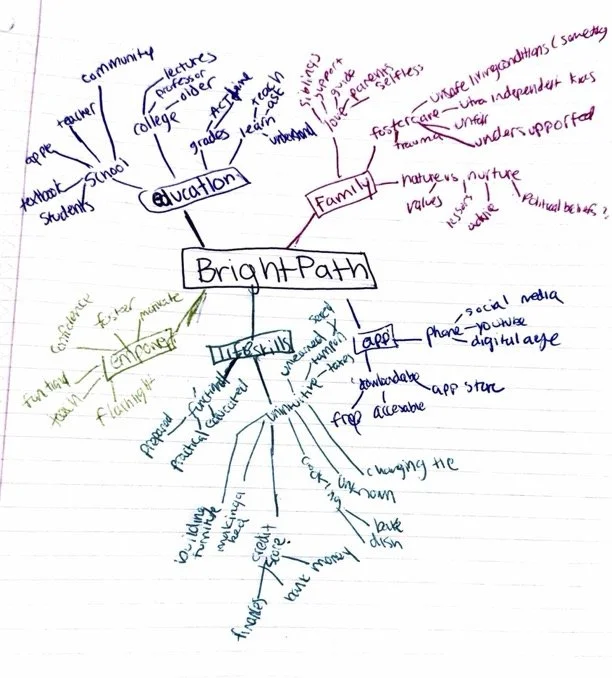
For my Visual Communication and Advocacy class, the assignment was to create a concept for a hypothetical organization advocating for a cause and design promotional materials. I developed BrightPath, a conceptual life skills app to teach underserved youth practical skills often not taught, such as computer literacy, online safety, cooking, job preparation, and personal hygiene, like putting in a tampon. Inspired by my mentorship experiences, I created a comprehensive brand identity that refined my skills in typography, color theory, layout design, and branding.
Style Guide
This style sheet outlines the chosen colors, typography, and branding elements, serving as a guide to maintain a cohesive brand identity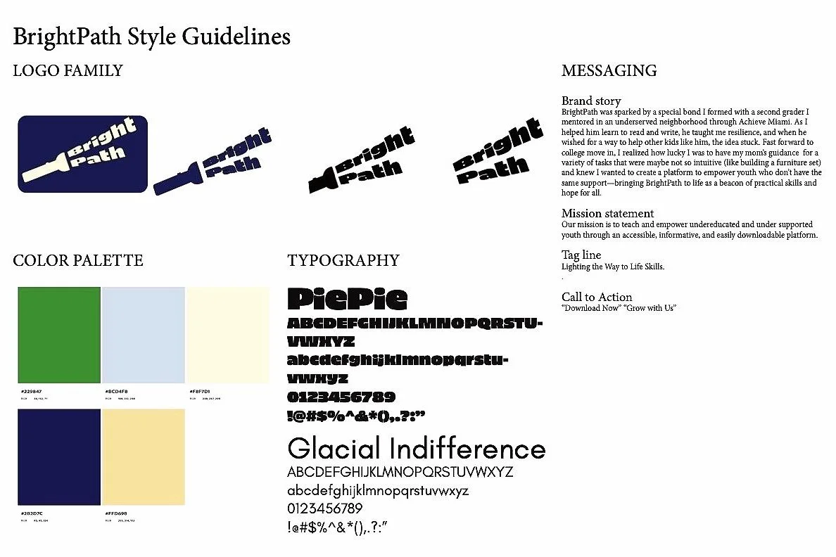
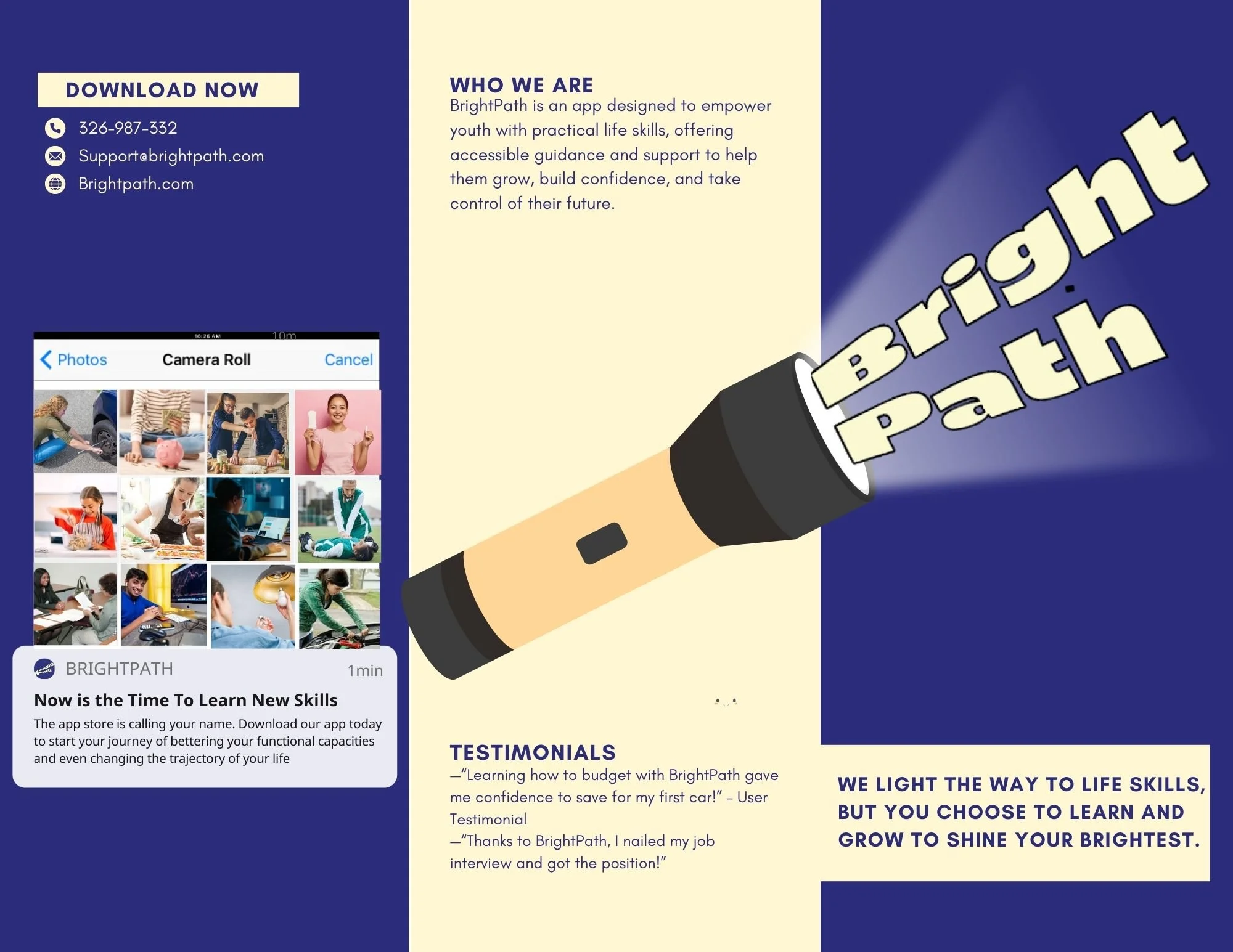
Trifold Brochure
The trifold brochure allowed me to explore engaging call-to-action elements, like "Download Now," while crafting essential text to draw in users. I also designed a preview of the app layout and experimented with overlapping images and bold visuals to create a dynamic and inviting design that highlights the mission.

logo
The logo family features a flashlight icon paired with typography that follows the natural shape of light leaving a flashlight, with a simplified text-only adaptation (bottom right) for versatility and clarity in smaller applications.
Mood Board
The mood board uses playful blue and yellow tones to appeal to middle and high schoolers, with a flashlight motif symbolizing guidance and self-development, illuminating visuals that represent the practical skills to be taught.
Progress Pictures